The Sakita Method · Hashtags + Stilettos · 2016–2020 · journal launched 2021
Podcast & Product Design
Give a growing podcast brand a connected visual language for identity, episode marketing, and a physical journal.
- Design direction
- Directed podcast branding and designed promotional graphics.
- Outcome
- A documented identity system and recurring content assets, followed by an approved journal design. The client launched a modified version in June 2021.
- Delivery status
- Brand and promotional assets delivered · journal approved August 2020
- Key constraint
- Support the brand’s evolution while making recurring promotional graphics practical to reuse.
- Team
- Narsha Njoya — creative direction and design, Neosha Gardner — original Hashtags + Stilettos logo collaboration, Sakita Holley — client direction and content
My role
What I owned.
I led the design relationship, developed The Sakita Method’s brand system and promotional assets, and designed the journal covers, interior pages, and sticker.
Brand system
Give the personality a repeatable structure.
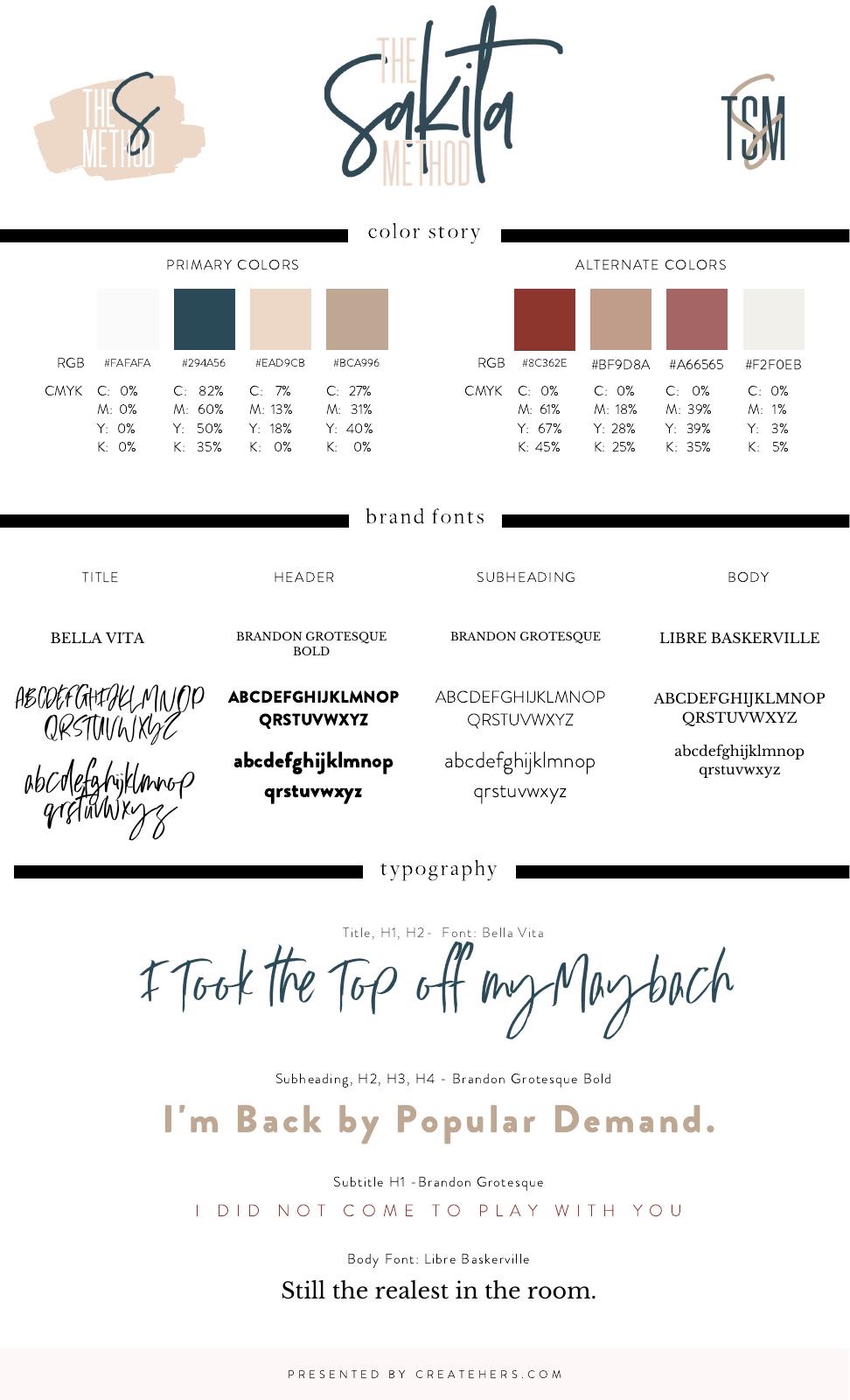
The Sakita Method identity combined expressive script, condensed lettering, a flexible palette, and supporting typography. The style guide brought the logo variations, primary and alternate colors, and font roles into one reference.
Brand evolution
From podcast identity to an ongoing content system.
The relationship began with Hashtags + Stilettos in 2016 and continued into The Sakita Method. My work spanned creative direction, podcast graphics, and the later identity system. Neosha Gardner collaborated on the original Hashtags + Stilettos logo.
Social design
Design for the next episode, too.
The 2020 promotional project covered solo and guest episode announcements, audiograms, Instagram Stories, and supporting patterns. I prepared reusable templates so the team could continue producing episode graphics after the initial batch.
Product design
Extend the brand into a journal.
For Done Is Better Than Perfect, I designed front and back covers, interior pages, and a separate sticker graphic. The work moved through cover options, interior-layout feedback, and final approvals in August 2020.
In June 2021, the client confirmed that the journal had launched with changes to the version I delivered. That launch is distinct from the original approved design.
Web work
A broader digital engagement.
The wider project also included website wireframes, design work, and asset handoff. This case study focuses on the identity and promotional work that can be directly documented; a completed website launch is not claimed.