House of Success PR · 2017–2018
Agency Brand Refresh
Give an established beauty and lifestyle PR agency a refreshed identity and a welcoming digital front door.
- Design direction
- Refreshed the logo and visual identity.
- Outcome
- A recognizable identity carried from the agency’s landing page into its launch communications.
- Delivery status
- Logo and landing-page work delivered · 2017–2018
- Key constraint
- Retain the signature blue and keyhole recognition while updating the typography and hierarchy.
- Team
- Narsha Njoya — design, House of Success PR — client direction
My role
What I owned.
I designed the logo refresh, landing page, before/after launch graphics, and extensions into business collateral.
Identity
Keep the recognition. Refine the expression.
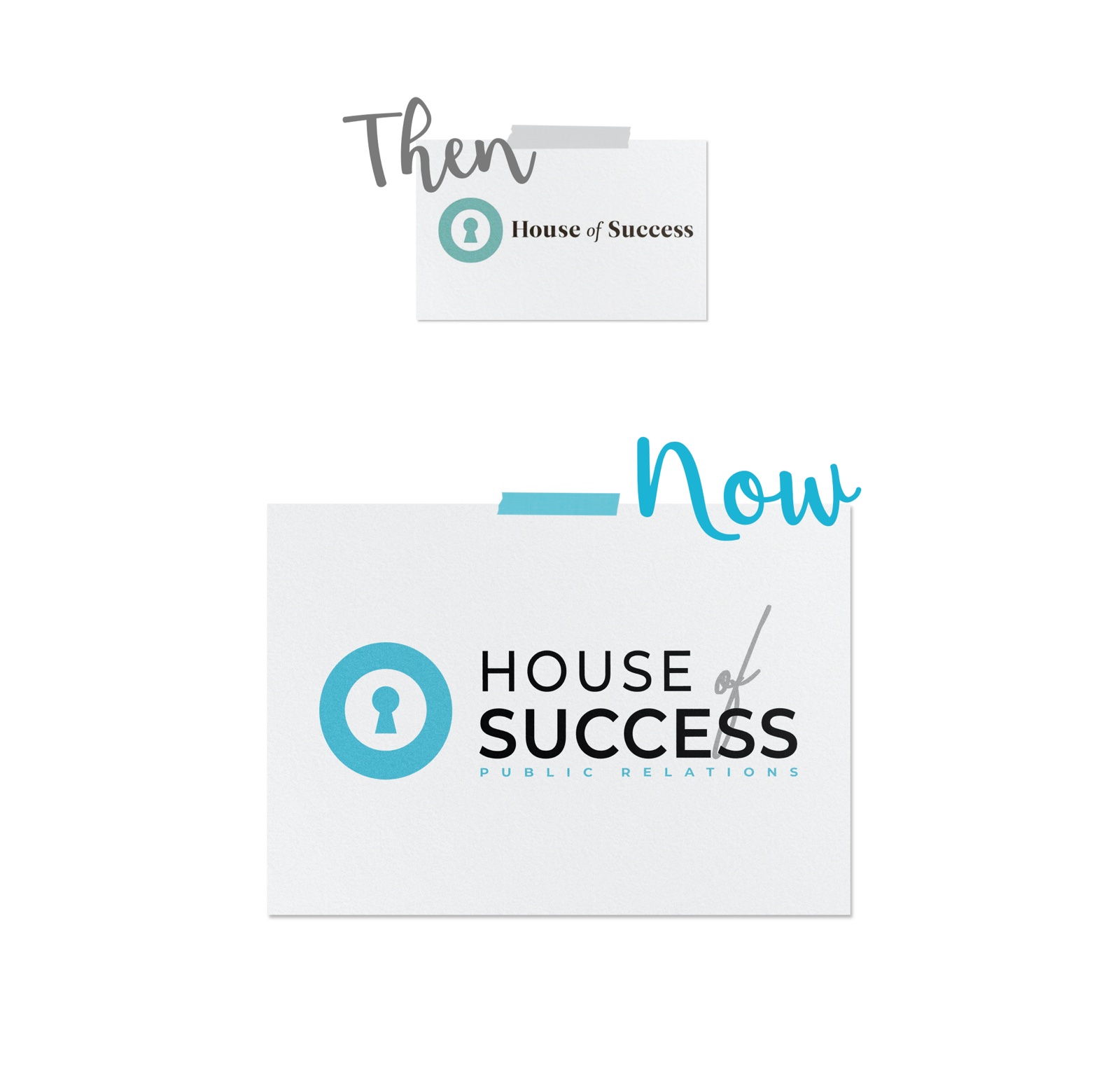
The keyhole symbol and blue palette connected the refreshed identity to the agency’s existing presence. I reworked the typography and composition so the name and public-relations descriptor read as a more deliberate system.
Starting point
The previous digital front door.
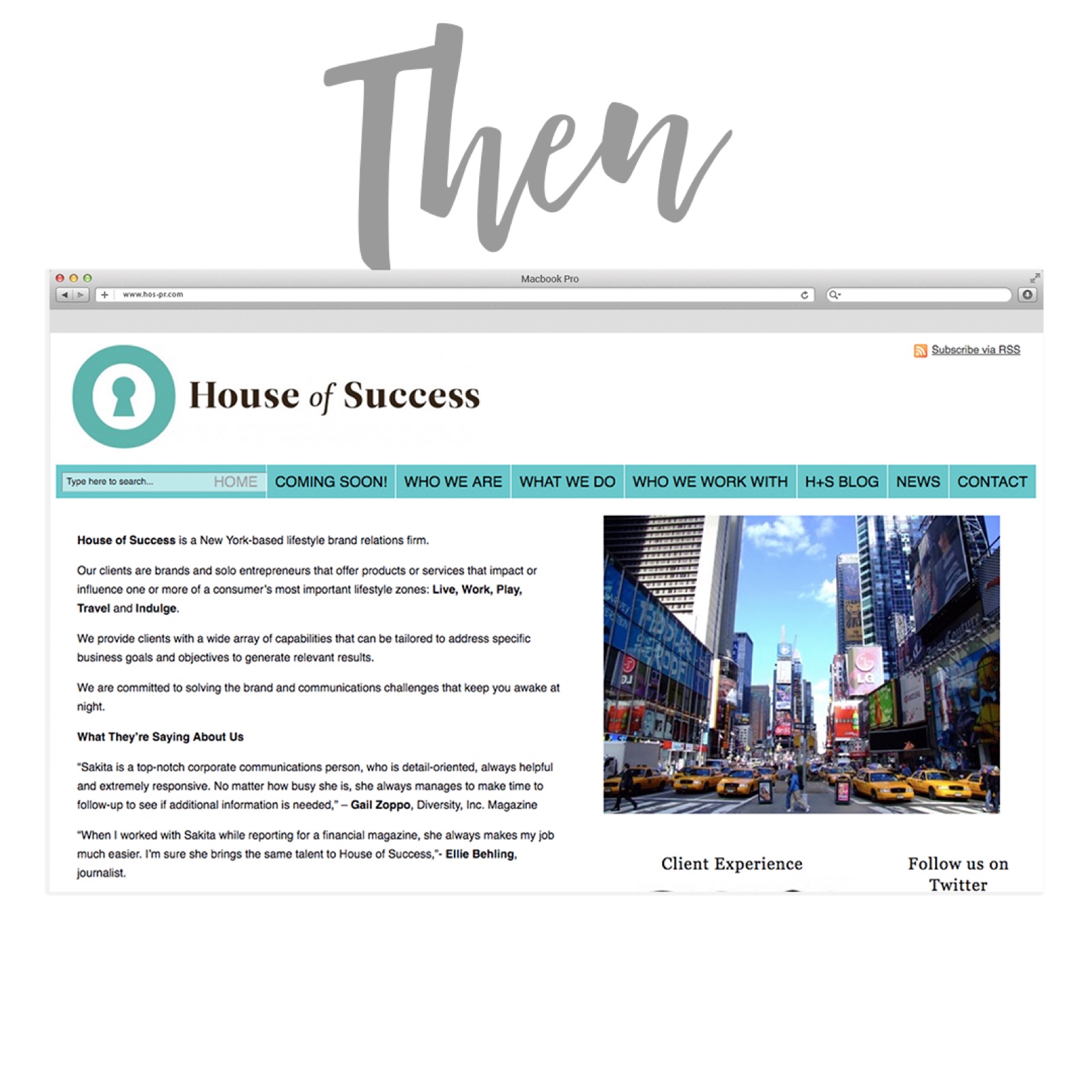
The earlier homepage provided the starting point for the refresh. The project focused on a landing page that could welcome visitors and maintain a contact path while the broader site was being developed.
Web design
A welcoming page with a clear next step.
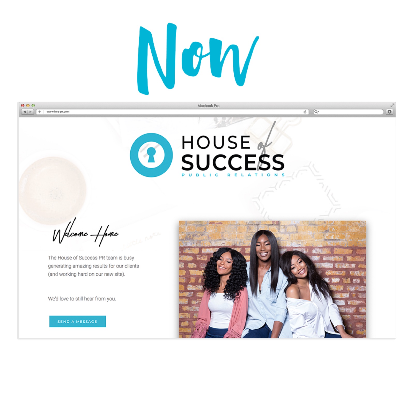
The landing page paired the updated identity with team photography, a brief welcome, and a prominent message button. The composition gave the agency a useful public presence during the transition.
Applications
Carry the identity into the everyday.
The engagement also extended into business-card design, Instagram highlight icons, and a swipe-style before/after announcement. Those smaller applications helped keep the agency’s visual language connected across touchpoints.
Related work
The same partnership, different design needs.
Explore the client campaigns and creator-brand work that grew alongside this refresh.