Home — complete desktop page
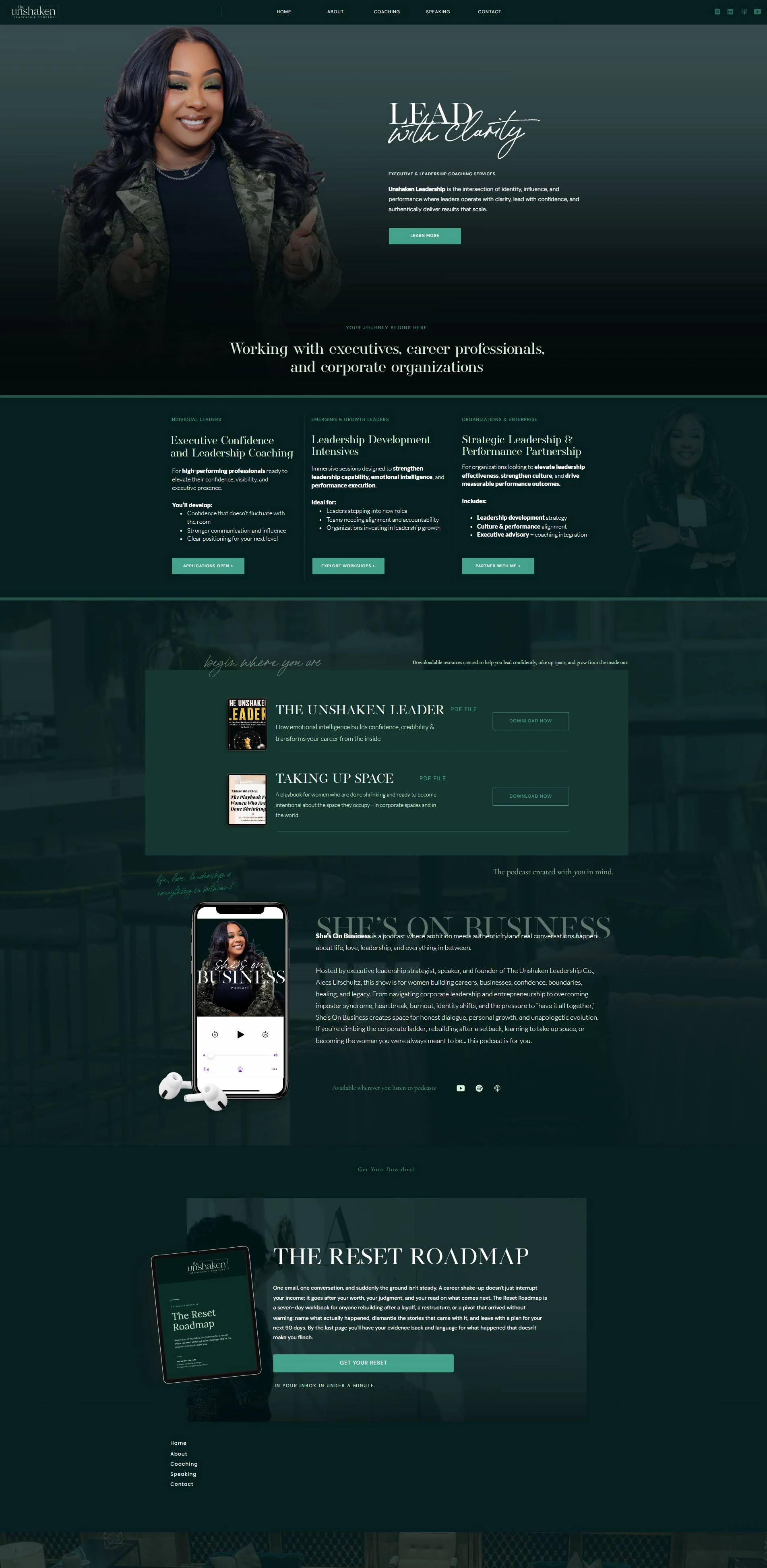
Unshaken Leadership Co.
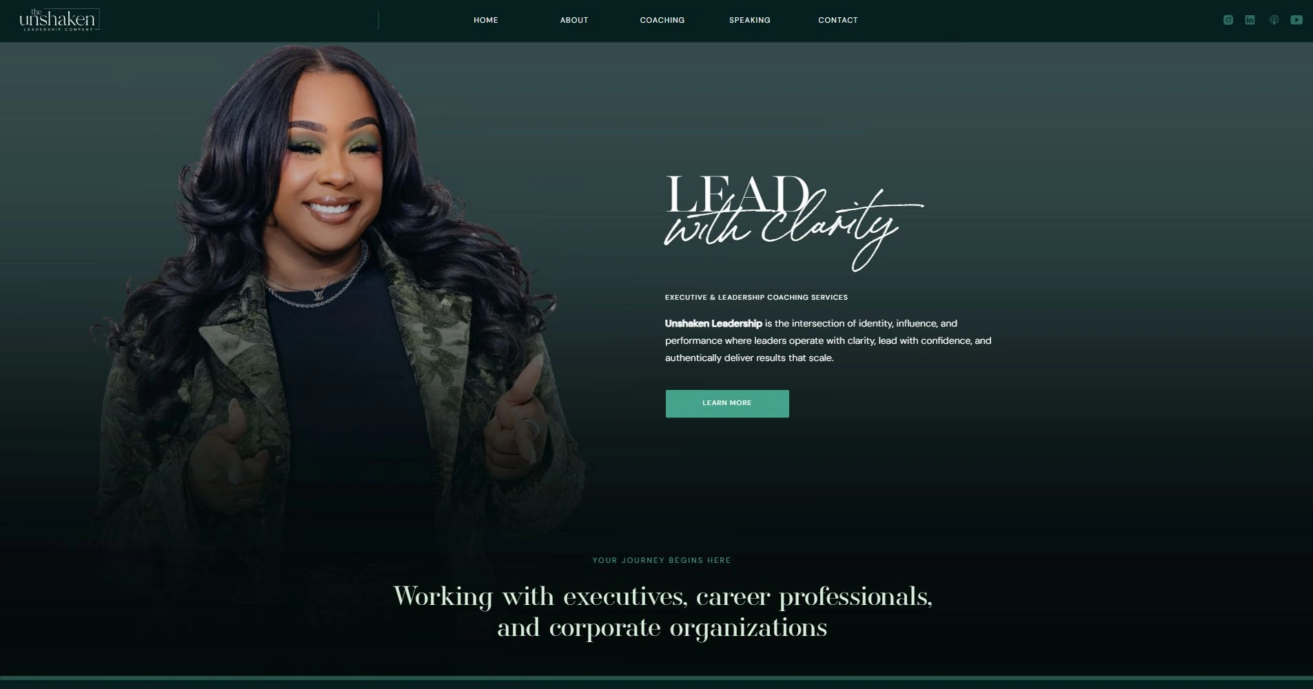
Strategy
The design challenge was deciding how the business should introduce itself. An individual seeking confidence coaching, an emerging leader, and an organization looking for a strategic partner arrive with different questions.
I connected the positioning, content hierarchy, and visual direction around those decisions. The main navigation stays focused on five destinations: Home, About, Coaching, Speaking, and Contact.
Audience pathways
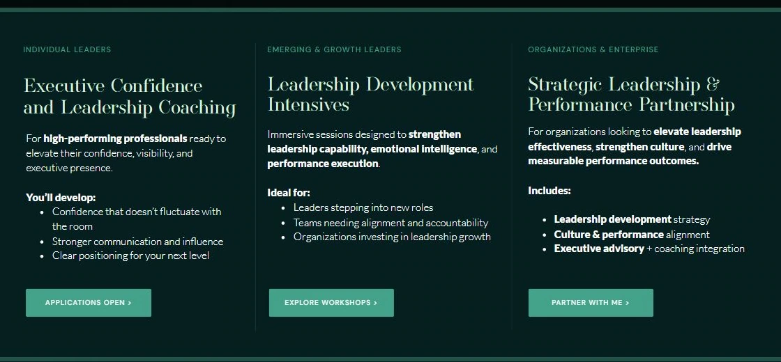
I organized the homepage service area into three audience-led routes: individual leaders, emerging and growth leaders, and organizations and enterprise.
Each route pairs a service name with who it is for, what the engagement addresses, and a relevant action. The choices support different levels of intent instead of repeating one generic call to action.
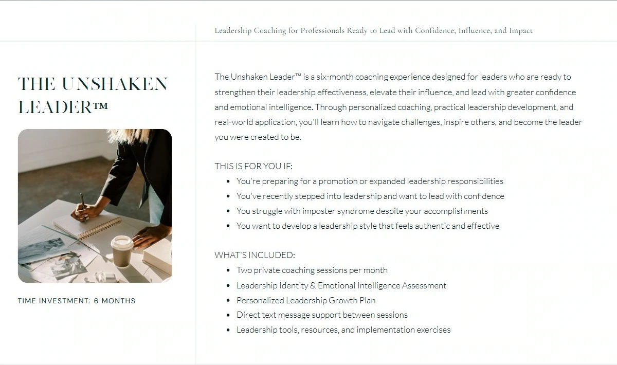
Coaching offers
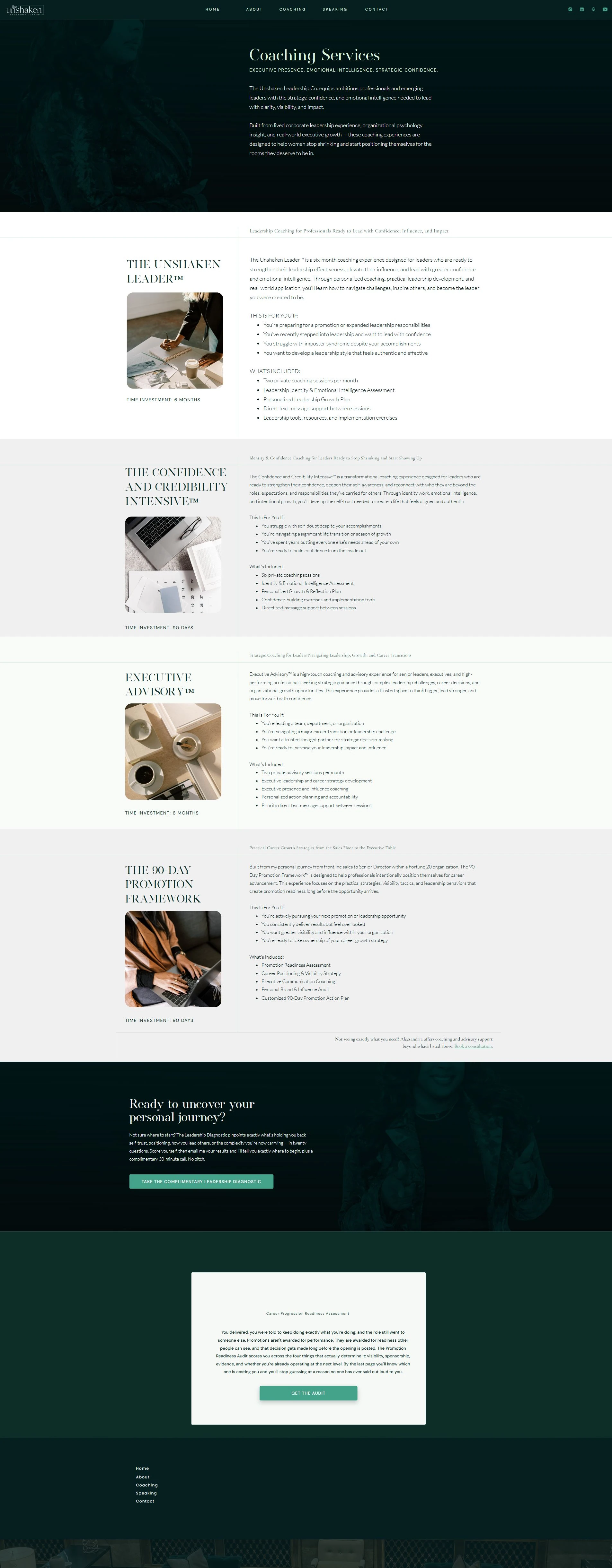
The coaching page uses a repeatable information pattern: an introduction, who the experience is for, and what is included. This turns broad leadership language into information a prospective client can evaluate.
Program duration, session structure, support, and deliverables sit together. The same content logic carries across the coaching and advisory offers, followed by a consultation route for visitors who need help choosing.
Founder credibility
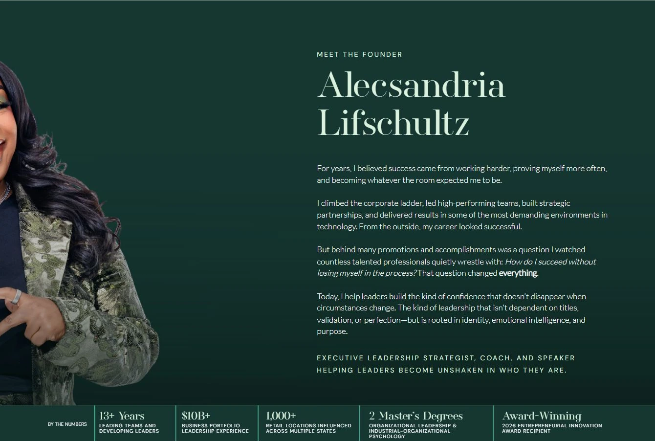
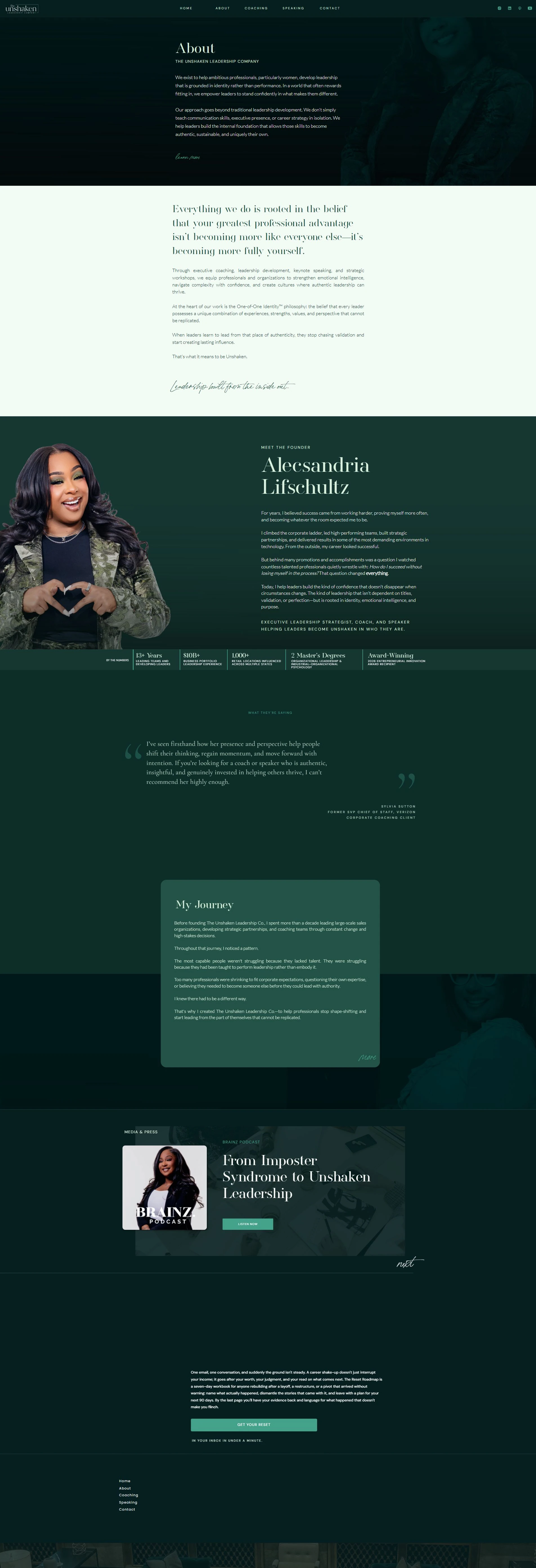
The founder story needed to feel personal while communicating professional depth. I paired portrait-led storytelling with a visible credentials strip, giving the narrative and the supporting facts distinct roles.
Deep green, warm light backgrounds, expressive serif typography, and clear text hierarchy carry the brand across pages. The credentials shown here describe the founder’s experience; they are not outcomes of the website project.
Service journey
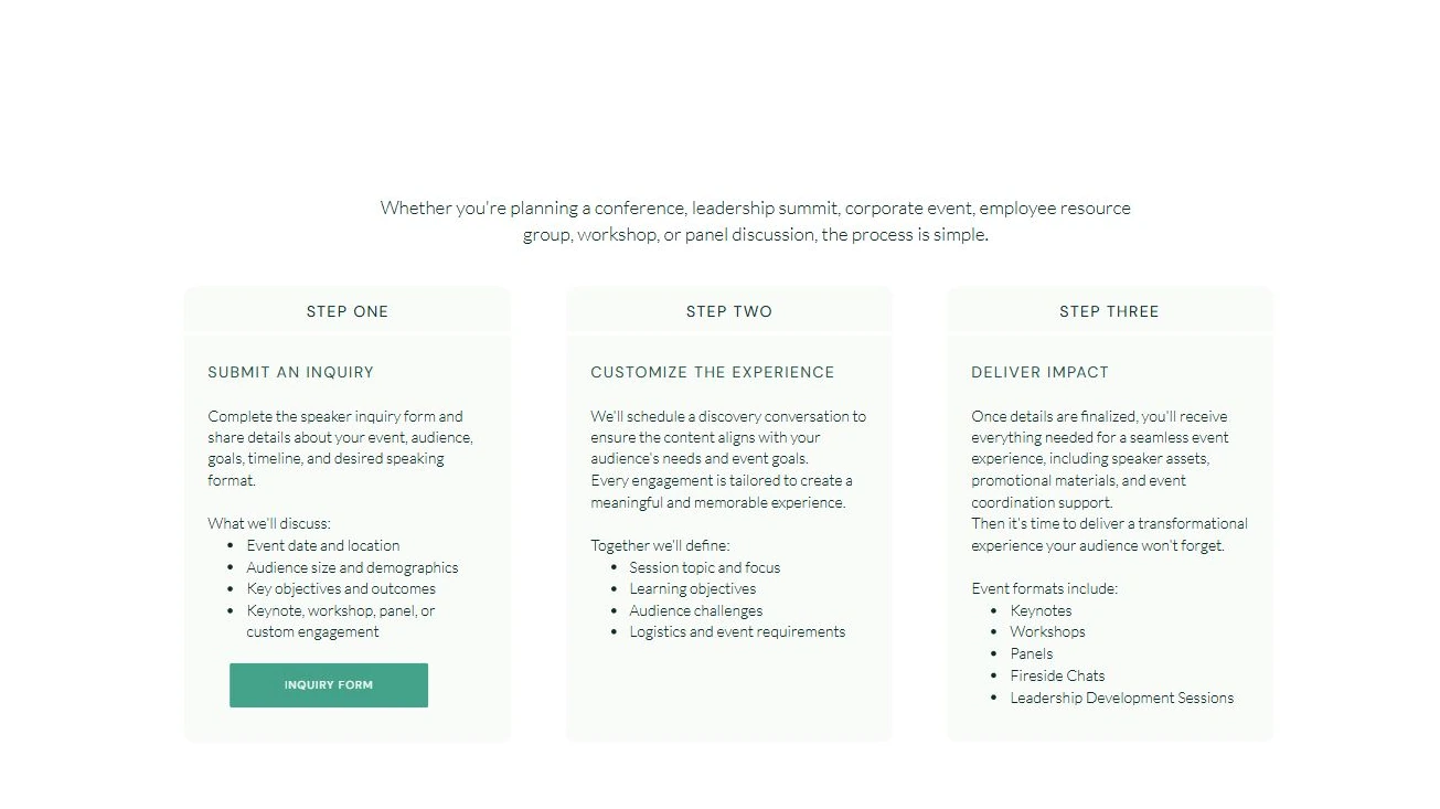
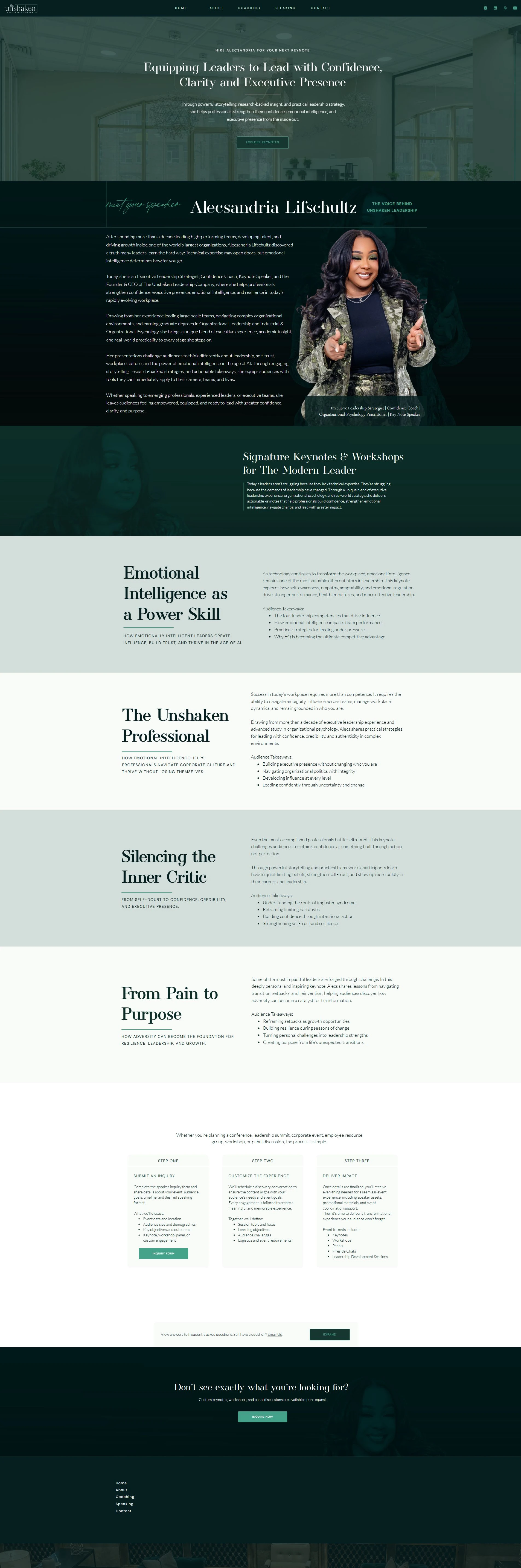
Speaking engagements involve more than selecting a topic. I structured the page around the speaker, keynote options, audience takeaways, and the practical steps that follow an inquiry.
The three-step sequence makes the service visible: submit an inquiry, customize the experience, and deliver the engagement. It sets expectations about discovery, audience needs, and coordination before an organizer reaches out.
Content ecosystem
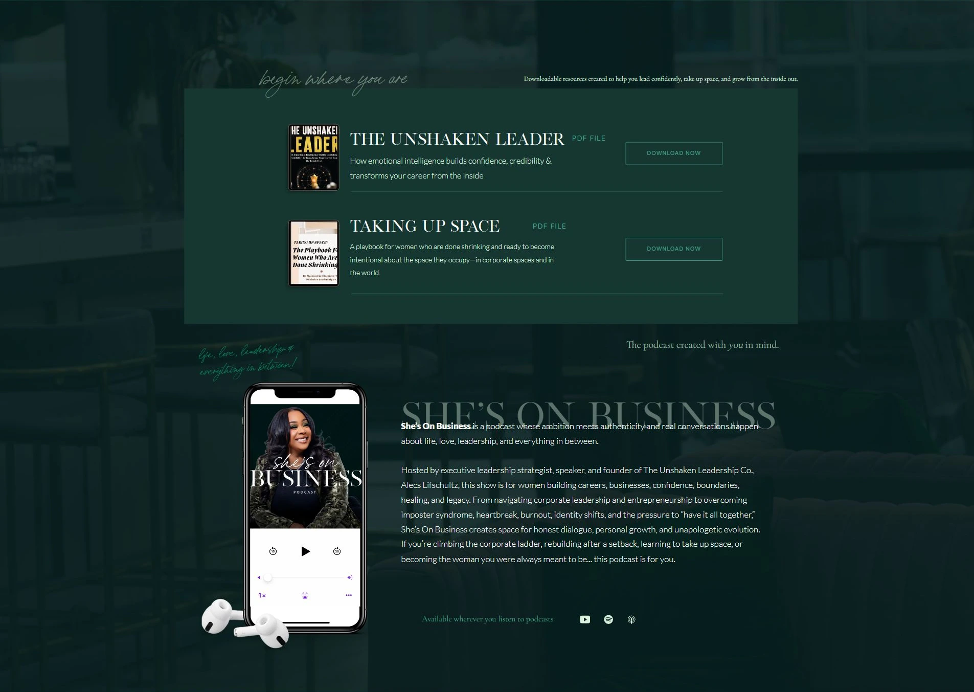
The homepage also brings resources and the She’s On Business podcast into the experience. These give visitors additional ways to engage with the founder’s perspective before they are ready for a coaching or speaking conversation.
I carried the brand’s typography, imagery, and action styles through those touchpoints, connecting the content experience to the broader leadership business.
Responsive design
On mobile, the portrait-led introduction, brand proposition, and next action become a vertical sequence. Service choices stack so each audience can read its own offer without navigating a compressed desktop layout.
The mobile capture shows the live implementation. The design keeps the same content relationships and visual identity while adapting the composition to a narrower screen.

Delivery & outcome
This engagement brought brand direction, messaging, information architecture, visual design, and Showit implementation together. The result is a live site with connected routes into coaching, speaking, content, and inquiry.
What I can show is the delivered system and the decisions behind it. I would evaluate its next iteration through inquiry quality, service-page engagement, and where visitors need help choosing an offer. Those are proposed measures, not reported results.
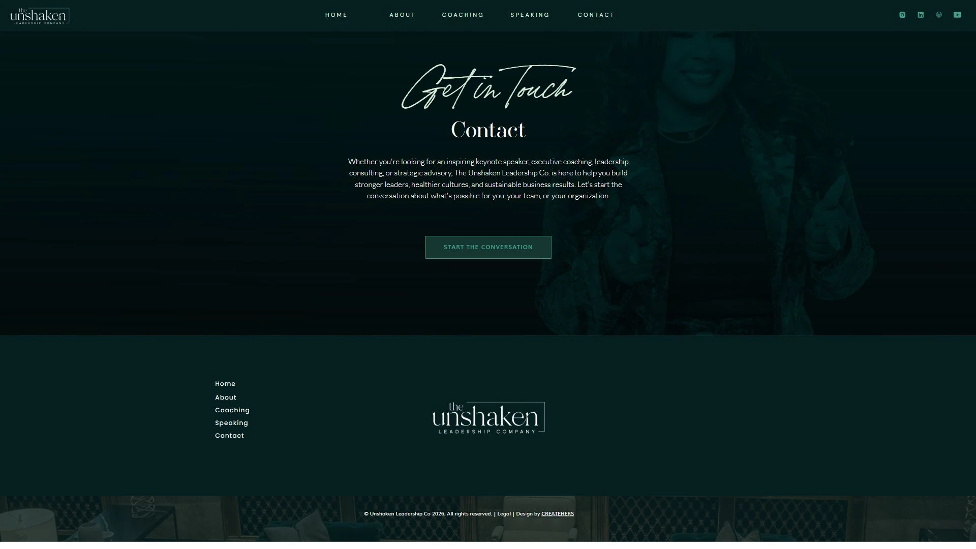
Complete boards and additional screens behind the selected details above. Enlarge any artifact to inspect it at full size.
Site architecture
Home → Audience pathways → Coaching offers → Consultation inquiry
Home → Speaking → Keynotes & audience takeaways → Booking process → Inquiry
About → Founder story & credentials → Coaching / Speaking
Content routes visible in the live website. These describe the designed pathways, not measured visitor behavior.