Delta Air Lines
Airline Baggage Tracking App: Designing for Airport Employees, Not Passengers
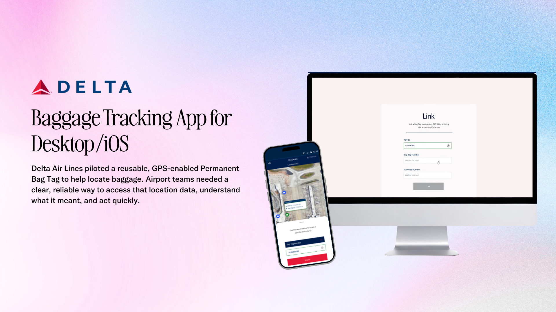
Delta Air Lines piloted a reusable GPS-enabled Permanent Bag Tag. The hardware could report where a bag was; the missing product was the employee experience that let airport teams retrieve that information quickly and trust what they saw.
PROJECT NOTES
At a glance
The challenge
A bag's location existed. Nobody could ask for it.
The actual problem, stated as a contradiction. The data was there; the retrieval path wasn't.
My role
My contribution
- Interviewed Above Wing and Below Wing agents to understand how each group searches for and acts on baggage location information.
- Observed passenger and baggage journeys at Hartsfield-Jackson Atlanta to map where the physical and information flows diverged.
- Conducted competitive analysis of consumer tracking products to identify where employee workflows required different interaction patterns.
- Mapped the end-to-end tracking flow in FigJam and utilized Delta Design System across the app's component library, wireframes, and interactive prototypes in Figma for desktop and mobile.
- Designed three search entry points—Bag Tag ID, Permanent Bag Tag ID, and SkyMiles number—to match the identifiers agents actually had in hand.
- Represented location as a point-in-time pin rather than implying live tracking, making the system’s accuracy limits explicit in the UI.
- Designed high-contrast type, large touch targets, and one-handed mobile interactions for bright terminals, gloved hands, and fast-moving airport environments.
- Iterated with business stakeholders to simplify screens and notification behavior, prioritizing speed and clarity over feature density.
- Ran remote usability testing focused on navigation speed, location clarity, and trust.
The problem
A bag’s location lived in five different systems
When a passenger asked where a bag was, an agent could be forced into calls, legacy terminals, and estimates instead of a clear answer.
That gap affected passenger trust, consumed agent time during already-busy operational windows, and limited the value of tracking hardware that could report location but had no fast employee-facing retrieval experience.
The design constraint that shaped the work: the solution had to fit into an existing shift with no unnecessary steps and match Delta’s established interface language so agents would not need to learn a second visual system.
- Passenger trust
- Uncertainty about checked baggage creates anxiety and downstream service pressure.
- Agent time
- Every manual lookup competes with time-sensitive work happening on the airport floor.
- Hardware ROI
- Location-aware hardware creates little value until employees can retrieve that information quickly and confidently.
Research
Shadowing bags and the people who chase them
Interviews with Above Wing agents surfaced the need to answer a passenger standing directly in front of them, while Below Wing agents needed to intercept bags already moving through the system.
At Hartsfield-Jackson Atlanta, I followed the passenger journey and separately followed the bag journey through the sorting system. The two flows rarely intersected, which clarified why the information gap persisted.
Competitive analysis of consumer tracking apps showed that they optimize for a passenger checking one bag occasionally, not an employee checking many bags repeatedly under time pressure.
- Agents need location at decision points, not continuous tracking—a clear point-in-time signal is more useful than a rich live feed.
- Identifiers vary by role and situation, so a single search method would fail.
- Minimal steps outrank feature richness; anything too slow loses to the radio and existing workarounds.
Design
One lookup, three ways in
I mapped the end-to-end tracking flow in FigJam, then built the component library, wireframes, and interactive prototypes in Figma for desktop and mobile.
Agents could search by Bag Tag ID, Permanent Bag Tag ID, or SkyMiles number—matching whichever identifier they actually had available in the moment.
The interface represented location as a pin captured when GPS activated rather than implying continuous live tracking. Naming that limitation protected trust by making the system honest about what it knew.
High-contrast type, large touch targets, and one-handed patterns were driven by the physical environment: bright terminals, gloved hands, movement, and divided attention.
Stakeholder iteration simplified screens and reworked notification behavior so the interface prioritized what an agent could parse mid-shift.
Testing + results
Trust had to be earned in seconds
- Remote usability testing focused on navigation speed, clarity of location information, and whether the experience earned trust.
- 90% of testers rated the app easy to use, with higher confidence in bag status.
- Agents reached proficiency with minimal training because the product reused Delta’s existing visual language instead of introducing a new one.
- Stakeholders identified the customer-satisfaction and brand-loyalty upside as the strongest argument for scaling the pilot.
What I’d carry forward
The interface held up. The hardware lifecycle did not.
The pilot ended early because the physical tags had been manufactured years earlier and could not be recharged, so the fleet aged out before the program could scale.
The lesson I carried forward was to treat hardware lifecycle and infrastructure constraints as research inputs, not assumptions.
What did hold up was the decision to design around a point-in-time signal instead of promising real-time tracking. The product was explicit about its limits, which is part of why the experience could earn agent trust.


Swipe or use the arrows to explore each screen. Use Enlarge image when a design needs a closer look.
Interactive prototype
Mobile prototype
Mobile view prototype: https://www.youtube.com/shorts/vmIlaPf-sKU
Impact
Impact
- 90% of testers rated the app easy to use and reported higher confidence in bag status.
- Agents reached proficiency with minimal training because the experience used Delta’s established visual language and familiar interaction patterns.
- The pilot was deployed for testing in April 2024.
- Stakeholders identified customer satisfaction and brand loyalty as the strongest business case for scaling the pilot.
- The pilot ended because the existing physical tags (designed outside of this project) could not be recharged; the hardware lifecycle became a key product-learning input for future work.